What is The Marriott
Loyalty App?
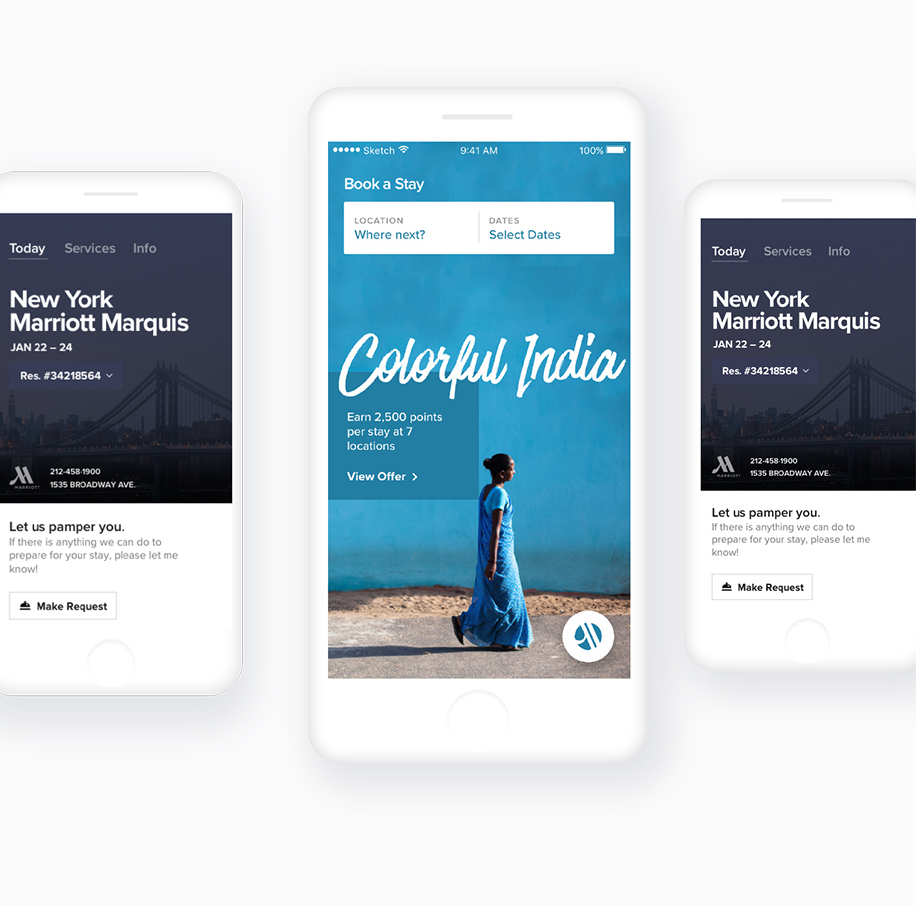
With 4,400+ hotels and resorts from 22 brands in over 120 countries, there's a hotel option available for all guest’ travels, and the Marriott Lotalty App provides exclusive benefits for Marriott Rewards members to make their stay better.
Mobile Check-In with Room Ready Alerts, Mobile Requests & Chat with the front desk for everything from an extra pillow to luggage assistance; Mobile Key, which allows you to go straight to the room at selected locations; and Mobile Check-out with late checkout requests from anywhere.

Challenge
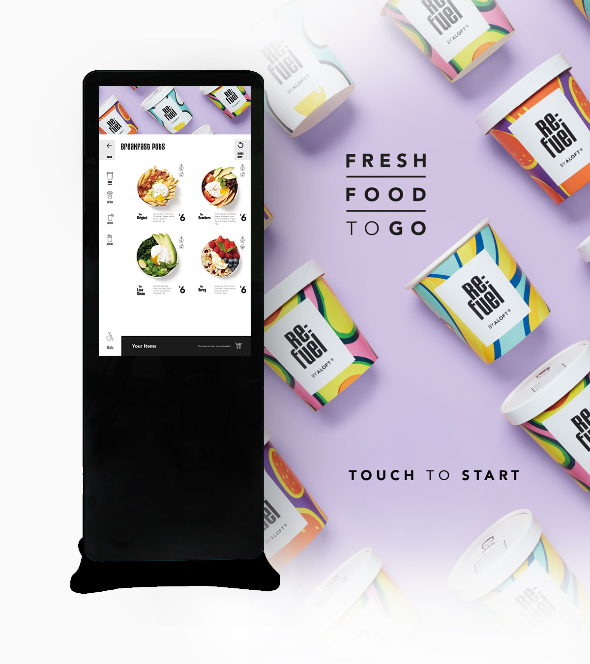
iRiS is the leading guest experience platform provider serving the hospitality industry. Using their library of APIs, customers can develop their own applications.
Our goal for the project was to create a food ordering section (The Mobile Dining App) for the Marriott Loyalty App. The Mobile Dining App is simply allowing guests to place orders during their stay or before they arrive to their booked hotel.
1st Stage Features
Available in 9 Languages
Outlet Availability
Availability of Menus/Foods based on the given delivery option
Create a cart
Modify the cart
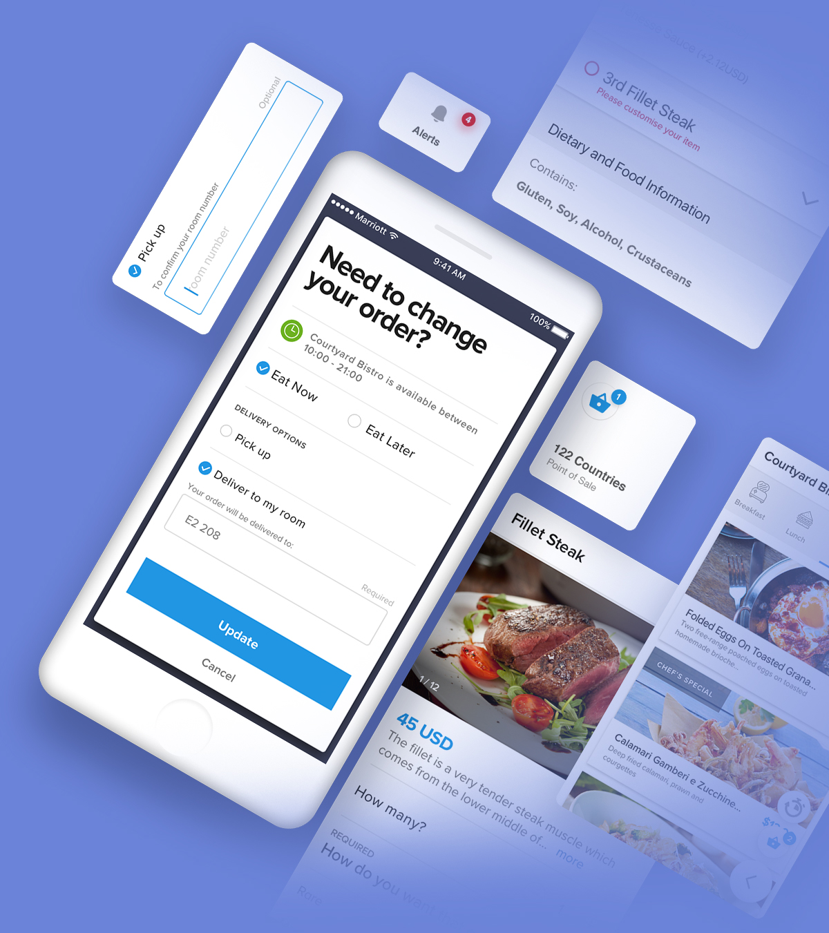
Delivery to Room
Delivery to a specific location (e.g. Poolside, Lounger 12)
Order to Pick-up
View Order History
Communicate to Outlets
Accessibility Mode : ADA - Level AA
Property Based Analytics : Sales, User Behaviour and Performance

Responsibilities
As a Lead Designer of the whole project, I’ve been given a task of understanding of main priorities, goals. Also had to work out the best combination of activities that will give us the outcome we need within the
time, budgetary and resource constraints
of the project.
Liased very closely with my stakeholders (on both Marriott and iRiS),
created workshops, brought competitor benchmarkings together, conducted usability lab-tests with actual guests
and actioned many more events to uncover insights and translate concepts between both business objectives and user objectives.
Learned what does and doesn’t work as well as what is or isn’t needed by interacting with the actual users during the design process.
* Various validation methods and techniques were used
in execution of the overall design which are explained in more detail through the following chapters.
One of the most important challenges was to translate solutions by using documentations, guidelines and deliver everything clearly
to everyone around me from a developer to a technical consultant.
*For the complete list of the team involved in the project see the end of the page.
Learning to work with people in other disciplines is essential
to get ahead of the successful project conclusion. Applying this approach helped to overcome many obstacles in order to reach common, ultimate goal of creating the best possible product.
Research
Analysis
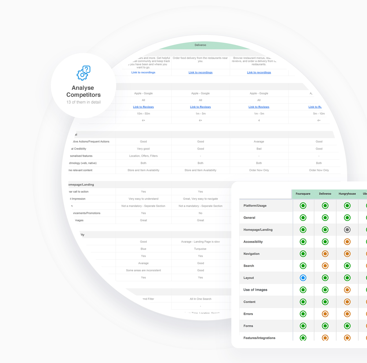
I have gathered as much information as I can within a short period of time. There are many companies I have investigated and the ones that played a crucial role in the whole project is listed below.
During the analysis, I captured data based on the user reviews both positive and negative and also factored how efficient, effective or statisfactory product such competitors are providing.

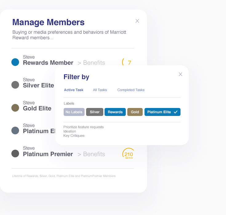
User Profiles - Desk Search
Thanks to Marriott’s Loyalty App, there was already a valuable amount of user profiles available to us. Essentially, we used this to define user base, the way users behave and also several possible use cases for the Mobile Dining App.
Guest Interviews
While in Washington, I conducted individual interviews with Platinum, Gold and Silver members of the Marriott Loyalty Program. Interview questions were mainly focusing on how users would interact with the features. Also, using Marriott Mobile Dining App, what services they would engage with mostly, what problems we could solve during their stay or before they arrive at the hotel. Essentially we figured out pre-arrival orders are playing a very critical role especially for business travellers.
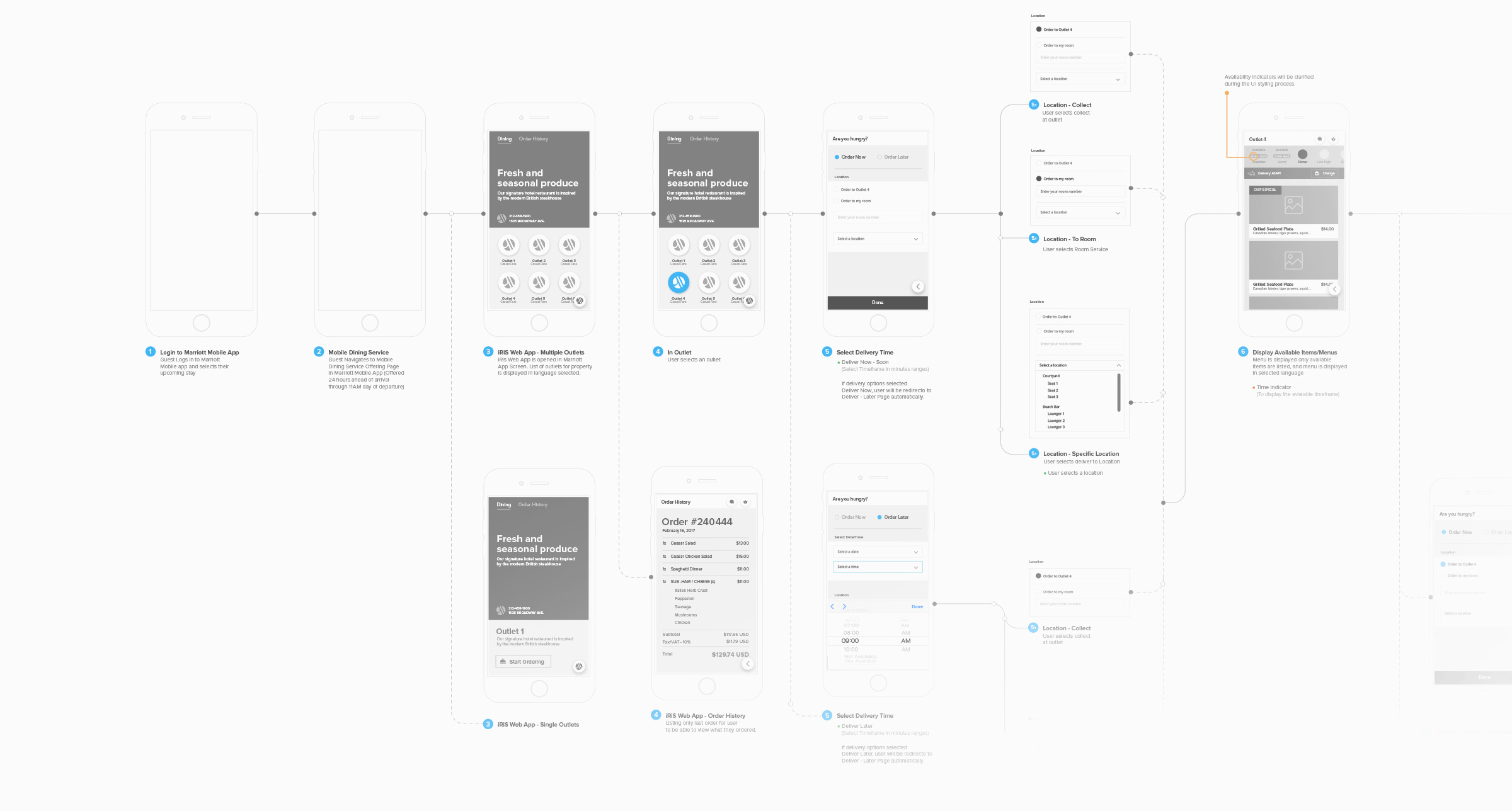
User Flows - Screen Views
While narrowing down and prioritising the needs, without investing too much time to create any UI patterns, I started to determine and map out various flows in order to achieve both parties’ goals.
Usability Test - Quick Feedback
Once I had the interactive Prototype in Marvell, I planned usability testing sessions with Marriott Guests in Washington/Maryland. The goal was to learn if they are able to complete some tasks successfully without my help and identify changes required to improve user performance and satisfaction.
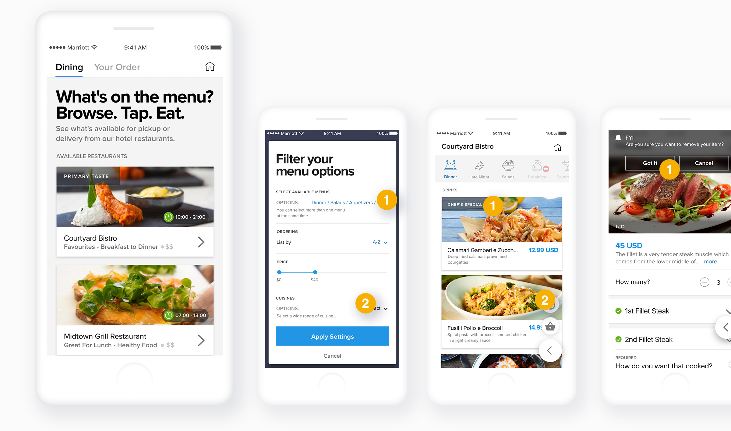
Through the lab tests, we discovered that people have to put too much energy to find out what is available in the outlets. They needed a better and faster way to view the available food options. This allowed us to first display outlets with food type, price level and availability and then move on to what delivery option user would like to have, so eventually they can list available Foods and Drinks based on their selection. In the first session of the interviews and usability tests I had 12 participants joined in. With the other following sessions I had the chance of interacting with 33 actual guests from the members of the Marriott Loyalty Program.
-
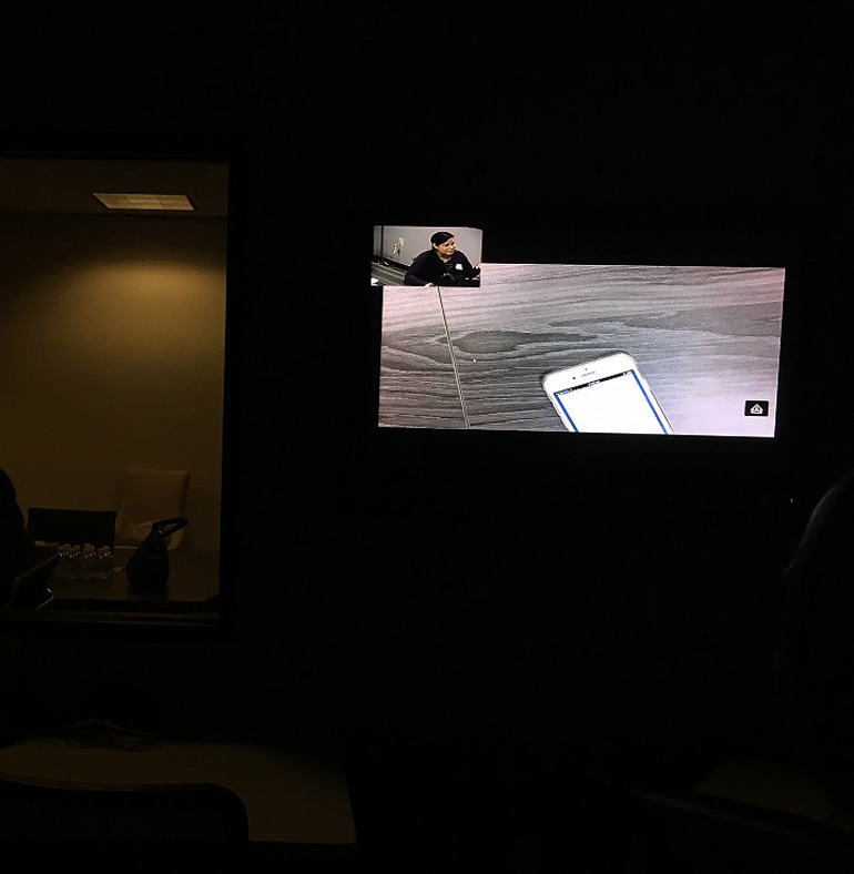 Lab Test
Marriott Head Office
-
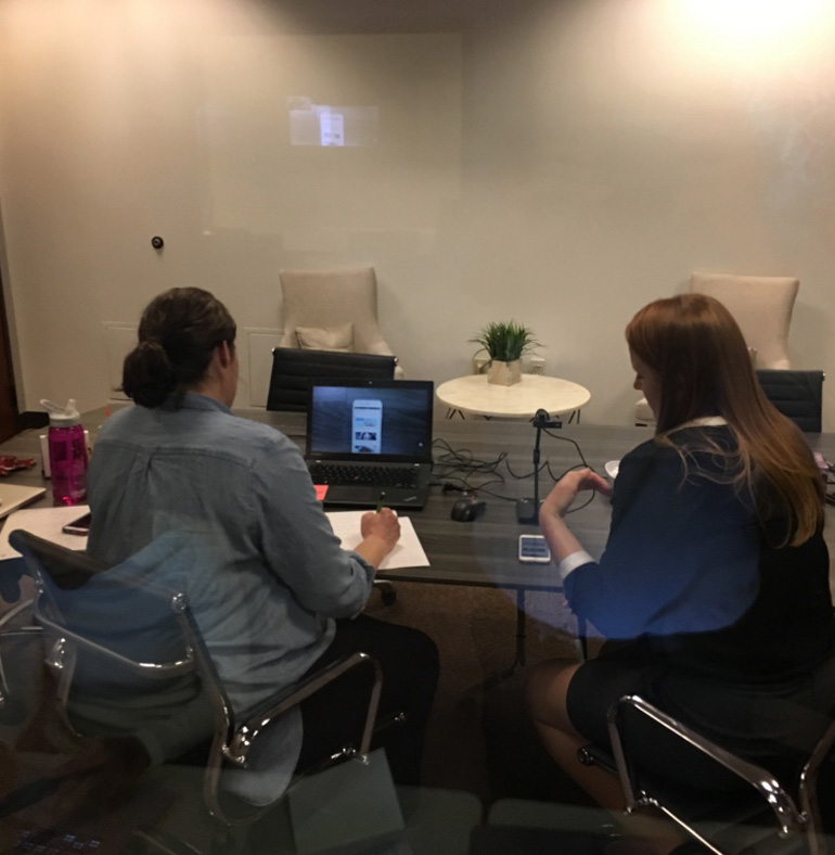 Lab Test
Marriott Head Office
Early Prototypes
*
This is an improved version from one of the interactive prototypes. Please use it to navigate through...
Select an available outlet / Set your delvery options / View Items / Place order / View Order Confirmation / View History
Iterations and Improvements
After numerous iterations and testing with users I gathered all the pain points from the user validation tests and synthesized them together. This is where I also brought my stakeholders and developers into the loop to start bouncing ideas together.
FINDINGS*
9/10 considered reaching to menu is taking too long and they would prefer to see the basic information earlier (e.g Restaurant Availability, Price, Cuisine…etc)*
8/10 found the feature of getting in touch with the outlets is very important after placing their order.*
8/10 found the use of images were very prompt.*
9/10 wanted to see the sections still available to browse even though they weren’t available to order.*
7/10 were very happy with the information given in detail for each section and item.
Designing The Solutions
Once the rough feature sets are decided, it is the time to replace long brainstorms by focused daily stand-ups that involve people essential to the work being done.
UI Challenges
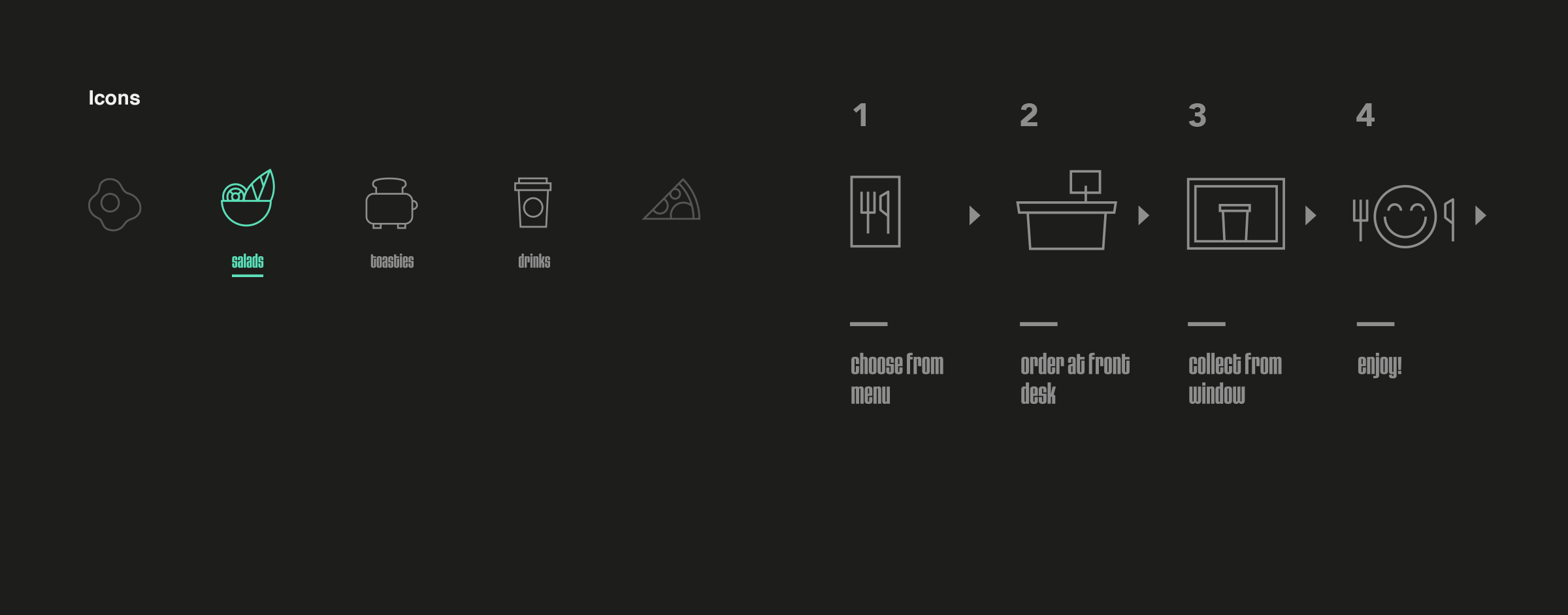
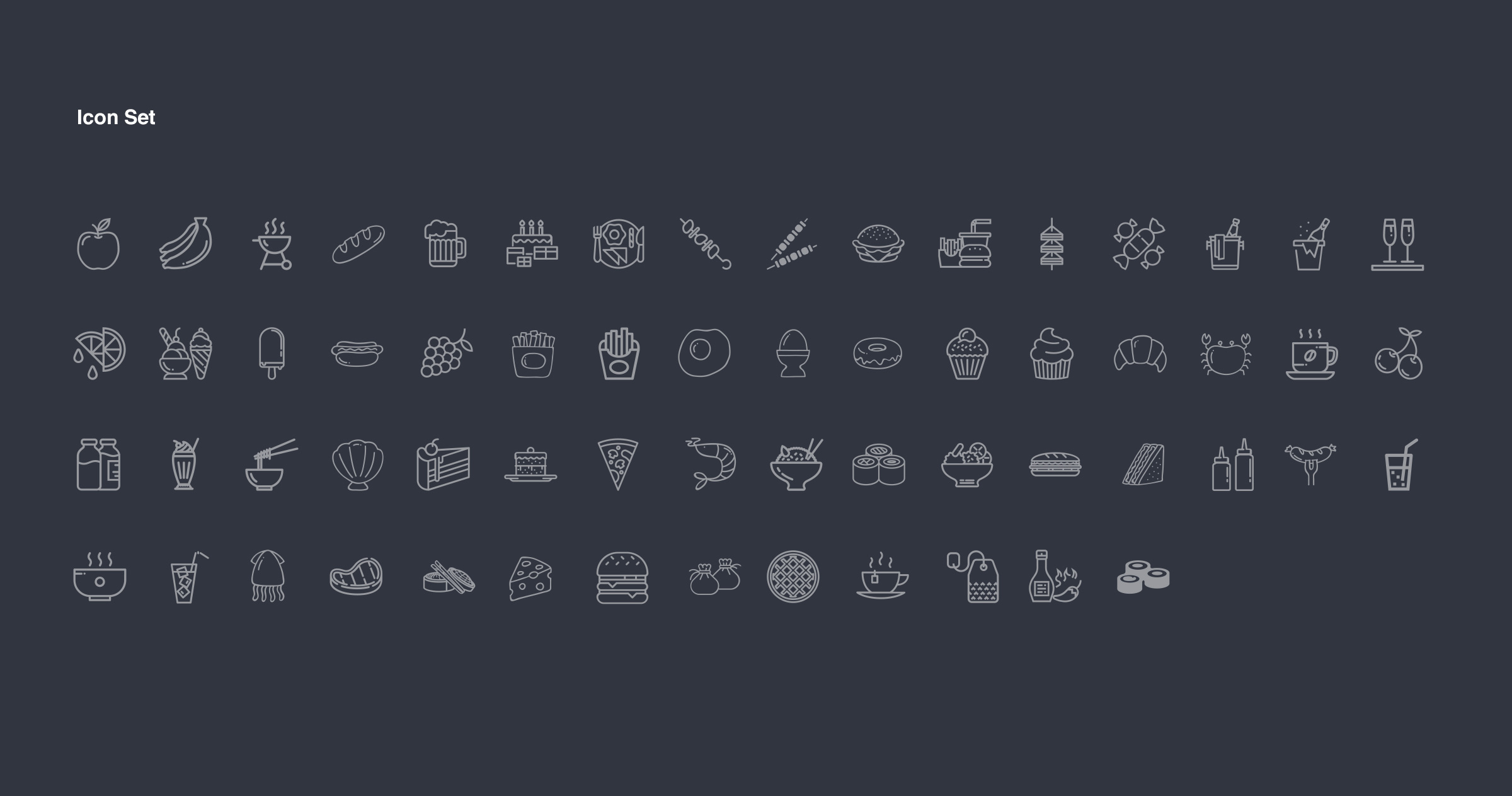
It is vital to keep the experience as seamless as possible when you build something new on top of an existing product.There are now new features included into the app via Mobile Dining Section and while I was building all the layouts, ui elements, gestures and the rest of the other visual experiences, I started carefully studying the Marriott’s existing mobile app and its guidelines.
Consolidate Design
Following the Agile UX process, the team started to focus on deep discoveries with epics, user stories and the backlogs to give them more ideas. Flows were wrapped and developers have also wrapped their technical research using all the given information. To consolidate their knowledge, I created guidelines and document over prescriptions. The technical details are contained using Zeplin and Confluence (Atlassin).
Annotating user flows were very useful as they led me to get great feedback even in the early stages of the conceptual design. Everyone could go in, including developers and product managers and all the teams around the project were able to also share the flows with larger Marriott team in US.

Analyse + 2nd Phase Upgrades
First Marriott Mobile Dining App launched in Courtyard Marriott in Maryland. Right now there are more than 200+ properties of Marriott which started using the app. More than 10.000 orders already placed. End of 2018, more than 4.000 properties will be using the app.
KPIs Setup, Feedback
During the production phase, I immediately started to create the very basics of the analytics which will allow me to gather information relevant to Sales, Staff Performance, Product Peformance and User Behavior. Right now we are able to monitor the performance of each property using GA and Smartlook.
2nd Stage Features:
Include 12 more languages
Add Filter/Search
Personalisation Setup
Promotions
Order Status
Two Way Messaging
Geo-Targeting & Beacons
Conclusion + Credit
It’s been an amazing journey so far! I’ve learned and applied a lot of my skills around the entire project. Through collaborative brainstorming, regular user validation and scalable design sprints, the team can better preserve creative integrity amidst fast timelines.
*
Explore product ideas with the parallel paths of user research and ideation, then converge afterwards to define requirements.*
Casual ideation workshops with a clear agenda helps remove fear of “dumb ideas” encouraging feedback from quiet team members.*
Product documentation acts as guidelines, with some flexibitlity allowed for creative freedom.*
Collaborative prototyping minimizes paper-trail documentation.*
Test with users as prototype fidelity increases (more users in the beginning, les is acceptable later on).
- CTO Paul Payne
- CIA Nelson Wotton
- Director of Operations Jeremy Ward
- Director of PS TeamSusan Mortiz
- Director of Systems EngineeringTobey Ljungberg
- Head of ProductMarvin Fraser
- Lead UX/UI DesignerFatih Kaygusuz
- Project ManagerAlberto Manuzzi
- Project CoordinatorNatalia Scott
- Head of Technical ConsultingJulian Dabbs
- Software EngineerKojo Frempong
- Software EngineerPhilip Bathe
- Software EngineerAna-Georgiana Zagrean
- Software EngineerPaul Stanley
- Front-End Developer Adam Brewer
- Front-End DeveloperMatthew Houghton
- Front-End DeveloperStefan Wawrzyniak
- Front-End DeveloperJohan Ohlin
- Sales ExecutiveDarren Panto
- Project Manager - North America Crystal Keen
- VP North America Operations Graham Rushin
- Support ManagerRobin Page
- IT Systems EngineerMichael Booth
- IT Plan - GO Bharat Parekh
- Enterprise Architect Harold Sutton
- Steger iii Warren (SP)
- Director of Mobile & Digital Guest Experience Sahara Muradi
- lead EngineerFahad Adbdallah
- Senior Director - GPMS Mark Perine
- Senior Project Manager Capri Martinez
- Senior Software Engineer Stephen Pallam
- Sr. Agile IT Project Manager Marian Yamoah
- Technical Manager Arun Menavan
- Senior Project Manager Dave Shebat
- Software Manager Subha Krishnan
- Head of DesignMelanie Shintaku
- UI DesignerCourtney Garland
- Senior Experience Designer Michael Mooney
- User Experience Researcher Caroline J Little
- Director of Digital & Mobile Guest Services Kate Chahi
- Assistant General Manager Jim Sun
- Senior Systems Analyst Jesse Lopez
- Application Support ManagerYazir Soriano
- Senior Director - Application Delivery Services Manish Gulati
- Software Engineer Mike Hovan
- Manager, Quality AssuranceJason Page
- Solution Architect Mindy Xiao
- eCommerce ManagerCorey Grzybowski
- Director Technical ServicesChris Corbishley
- Sr Director–Hotel Pre-SalesSophie Talbot
- Senior Product SpecialistBrian Bakke
- Strategic Account Sales ManagerDavid Jones
- Software Development ManagerMike Jackson